# css
# css 命名
- 包裹类
container, wrapper, outer, inner, box, header, footer,main, content, aside, page, section, block
- 状态类
primary, secondary, success, danger, warning, info, error, link, light, dark, disabled, active, checked, loading
- 尺寸类
large, middle, small, bigger, smaller
- 组件类
card, list, picture, carousel, swiper, menu, navs, badge, hint, modal, dialog
- 位置类
first, last, current, prev, next, forward, back
- 文本类
title, desc, content, date, author, category, label, tag
- 人物类
avatar, name, age, post, intro
# CSS 渐变
CSS 渐变使您可以显示两种或多种指定颜色之间的平滑过渡。CSS 定义了两种渐变类型:
- 线性渐变(向下/向上/向左/向右/对角线)
- 径向渐变(由其中心定义)
如需创建线性渐变,您必须定义至少两个色标。色标是您要呈现平滑过渡的颜色。您还可以设置起点和方向(或角度)以及渐变效果。语法:
background-image: linear-gradient(direction, color-stop1, color-stop2, ...);
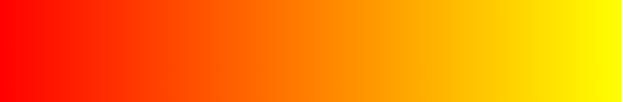
# 从上到下(默认)
#grad {
  background-image: linear-gradient(red, yellow);
}

# 从左到右
#grad {
  background-image: linear-gradient(to right, red, yellow);
}
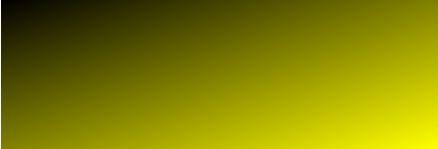
# 对角线
#grad {
  background-image: linear-gradient(to bottom right, #000, yellow);
}
# 使用角度
如果希望对渐变角度做更多的控制,您可以定义一个角度,来取代预定义的方向(向下、向上、向右、向左、向右下等等)。值 0deg 等于向上(to top)。值 90deg 等于向右(to right)。值 180deg 等于向下(to bottom)。
# 透明度
#grad {
  background-image: linear-gradient(
    to right,
    rgba(255, 0, 0, 0),
    rgba(255, 0, 0, 1)
  );
}

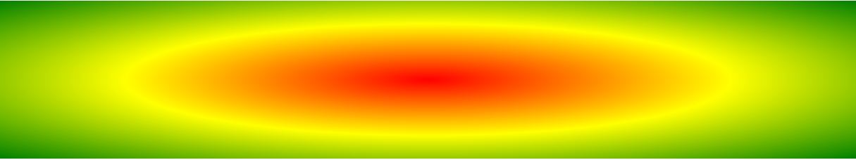
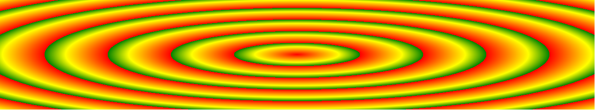
# CSS 径向渐变
径向渐变由其中心定义。如需创建径向渐变,您还必须定义至少两个色标
background-image: radial-gradient(
  shape size at position,
  start-color,
  ...,
  last-color
);
默认: shape 为椭圆形,size 为最远角,position 为中心。
例子 1:
#grad {
  background-image: radial-gradient(red, yellow, green);
}
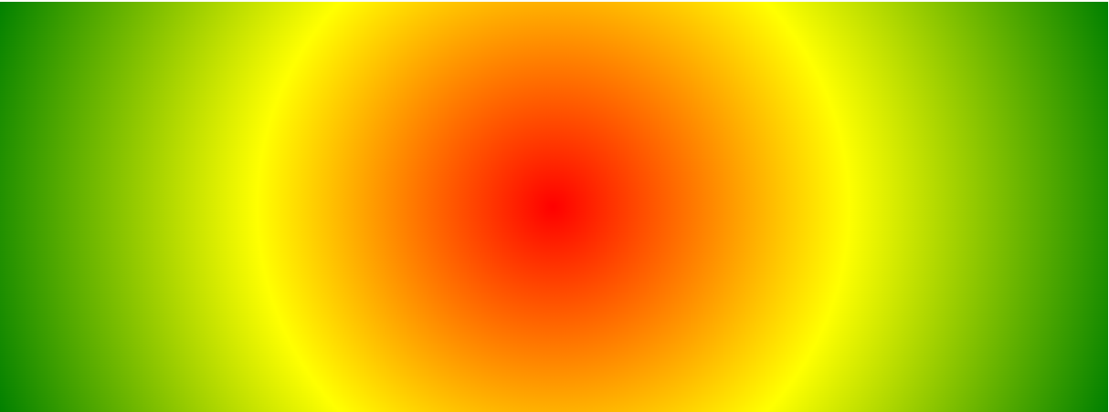
例子 2:
#grad {
  background-image: radial-gradient(red 5%, yellow 15%, green 60%);
}

例子 3:
/* shape 参数定义形状。它可接受 circle 或 ellipse 值。默认值为 ellipse(椭圆) */
#grad {
  background-image: radial-gradient(circle, red, yellow, green);
}
例子 4:
/* repeating-radial-gradient() 函数用于重复径向渐变: */
#grad {
  background-image: repeating-radial-gradient(red, yellow 10%, green 15%);
}
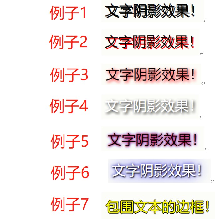
# CSS 阴影效果
# 文字阴影 text-shadow
/* 例子 1: */
h1 {
  text-shadow: 2px 2px;
}

/* 例子 2: */
h1 {
  text-shadow: 2px 2px red;
}

/* 例子 3: */
h1 {
  text-shadow: 2px 2px 5px red;
}

/* 例子 4: */
h1 {
  color: white;
  text-shadow: 2px 2px 4px #000000;
}

/* 例子 5 多个阴影: */
h1 {
  text-shadow: 0 0 3px #ff0000, 0 0 5px #0000ff;
}

/* 例子 6 : */
h1 {
  color: white;
  text-shadow: 1px 1px 2px black, 0 0 25px blue, 0 0 5px darkblue;
}

/* 例子 7 */
h1 {
  color: yellow;
  text-shadow: -1px 0 black, 0 1px black, 1px 0 black, 0 -1px black;
}
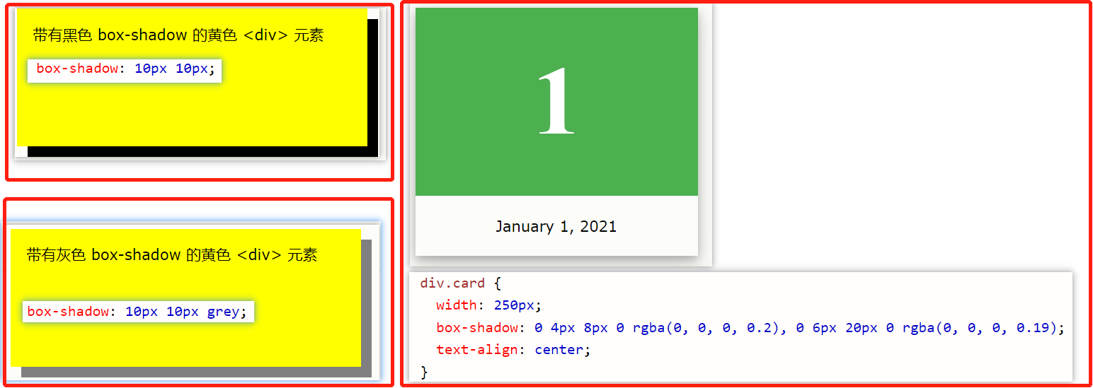
# 边框阴影 box-shadow
/* 例子 1: */
div {
  box-shadow: 10px 10px;
}

/* 例子 2:为阴影添加颜色 */
div {
  box-shadow: 10px 10px grey;
}

/* 例子 3:向阴影添加模糊效果 */
div {
  box-shadow: 10px 10px 5px grey;
}

/* 例子 4:创建纸质卡片效果 */
div.card {
  width: 100px;
  height: 100px;
  box-shadow: 0 4px 8px 0 rgba(0, 0, 0, 0.2), 0 6px 20px 0 rgba(0, 0, 0, 0.19);
}
# 媒体查询
https://www.w3school.com.cn/cssref/pr_mediaquery.asp
针对不同的媒体使用不同的样式表:
<link
  rel="stylesheet"
  media="screen and (min-width: 900px)"
  href="widescreen.css"
/>
<link
  rel="stylesheet"
  media="screen and (max-width: 600px)"
  href="smallscreen.css"
/>
例子:如果视口的宽度为 800 像素或更宽,请使用媒体查询将背景色设置为淡紫色;如果视口的宽度介于 400 至 799 像素之间,则使用媒体查询将背景色设置为浅绿色。如果视口小于 400 像素,则背景色为浅蓝色:
body {
  background-color: lightblue;
}

@media screen and (min-width: 400px) {
  body {
    background-color: lightgreen;
  }
}

@media screen and (min-width: 800px) {
  body {
    background-color: lavender;
  }
}
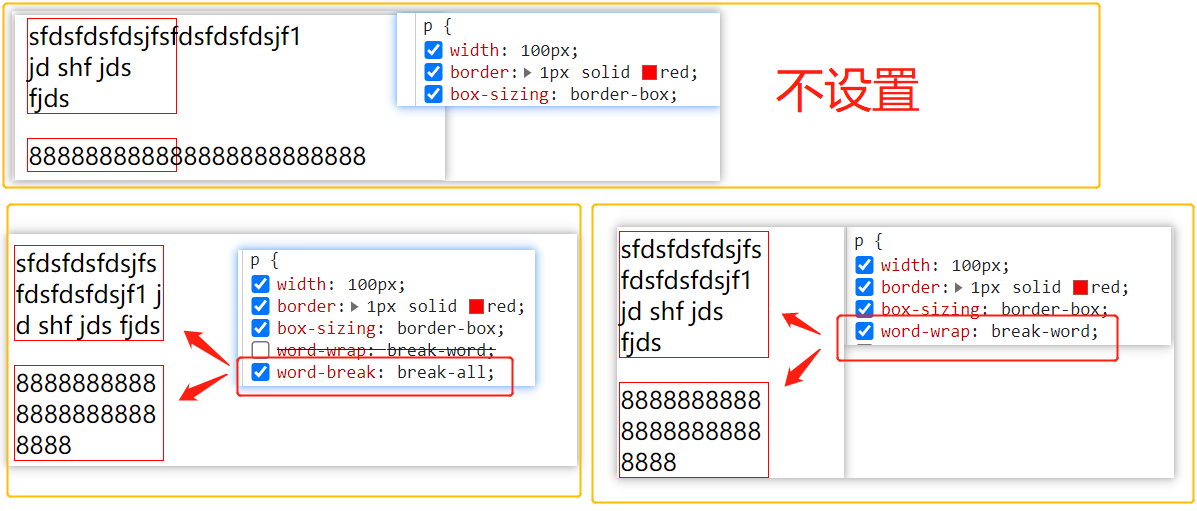
# 文本相关
- 强制文本在一行内显示:white-space: nowrap;
- 溢出内容为隐藏:overflow:hidden;
- 溢出省略号:text-overflow:ellipsis;
- 强制英文单词断行:word-break: break-all;
# word-wrap
word-wrap: break-word: 允许单词换行显示:
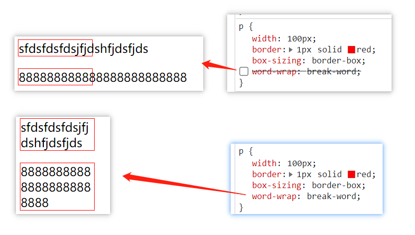
# word-break
语法:word-break: normal|break-all|keep-all;
- 强制英文单词断行:
word-break: break-all;(设置 white-space:nowrap 会失效)
# white-space
white-space 属性设置如何处理元素内的空白:
- normal 默认。空白会被浏览器忽略。
- nowrap 文本不会换行,文本会在在同一行上继续,直到遇到 <br> 标签为止。
# text-overflow
text-overflow 属性规定当文本溢出包含元素时发生的事情。一般配合overflow: hidden, 设置文本溢出...显示
- clip 修剪文本。 (默认)
- ellipsis 显示省略符号来代表被修剪的文本。
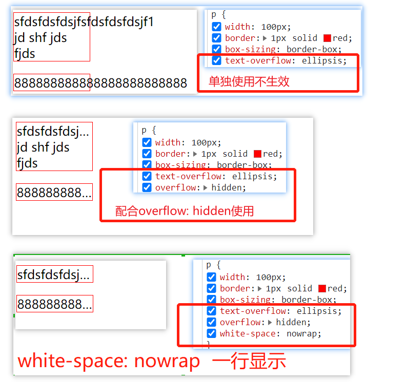
# 文本溢出...
<!-- 非flex布局实现文本溢出...显示 -->
<style>
  .ellipsis {
    width: 60px;
    border: 1px solid;
    overflow: hidden;
    text-overflow: ellipsis;
  }
</style>
<div class="ellipsis">88888888888888888888888888</div>

<!-- flex布局实现文本溢出...显示 -->
<style>
  .p {
    display: flex;
    width: 60px;
  }
  .child {
    flex-grow: 1;
    overflow: hidden;
    text-overflow: ellipsis;
  }
</style>
<div class="p">
  <span class="child">888888888888888888</span>
</div>